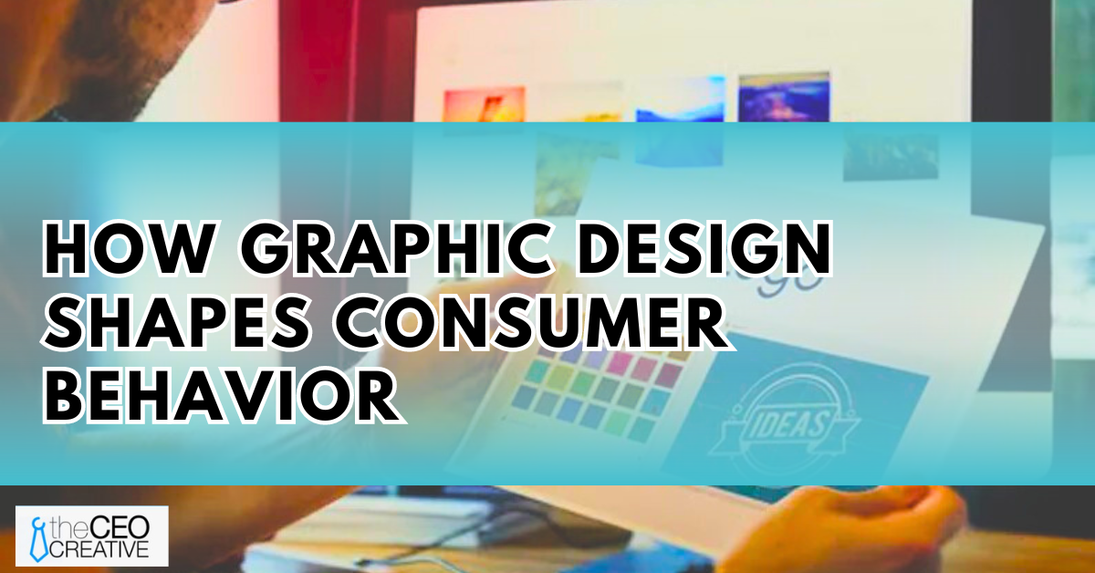
Consider graphic design not just as an aesthetic necessity but as a vital cog in the machinery of marketing. An intuitive understanding of how graphic design shapes consumer behavior, including design elements like color and typography, can be a game-changer for any business.
Preview of Day 6 Insights on Colors and Typography
As we delve into Day 6 of our exploration into the impact of design on consumer behavior, we’ll examine how colors and typography evoke emotions, preconceptions, and choices within consumers. We’ll explore theories that unveil their psychological impacts, supported by real-world examples, illuminating case studies, and the latest research findings.
Today’s focus will empower marketers and designers to appreciate the potency of these design elements and harness their power in creating compelling marketing strategies. We’ll also discuss practical tools and tips for implementing color and typography science into your brand’s persona.
Stay tuned as we unravel the mysteries of consumer psychology and design, and you’ll soon understand why your choice of color for that logo or the font for that tagline wasn’t as arbitrary as it may have seemed.
The Psychology of Color In Consumer Behavior
Let’s begin by examining how color can influence our emotions and perspectives. When we see a color, our brains trigger specific psychological reactions, many of which are deeply rooted in our cultural and personal experiences. These reactions can significantly impact how we perceive a brand, product, or campaign, making color a key player in graphic design and marketing strategies.
How Color Elicits Emotions and Shapes Perception
Color possesses the surprising power to evoke a range of emotions. For example, warm colors like red and orange can evoke feelings of passion and energy, while cool hues like blue and green often convey tranquility and reliability. In marketing, this emotional response to color can help set the tone for a brand’s identity or a product’s appeal.
Colors also mold our perceptions. Have you noticed how eco-friendly products often use green packaging? That’s because green is typically associated with nature and environmental friendliness. Similarly, brands with a luxury image might opt for black or gold hues to exude an air of sophistication and exclusivity.
Specific Colors and Their Impact on Buying Decisions
Each color possesses unique psychological traits. Here are a few examples:
- Red: Known to trigger excitement, urgency, or even appetite, it’s no coincidence that red is often used in sales promotions and fast-food branding.
- Blue: Seen as a color of trust and security, it is commonly used by tech and finance companies.
- Yellow: This color represents happiness and optimism, making it great for energizing and grabbing attention.
- Black: Symbolic of luxury, power, and elegance, black is usually used in high-end product marketing.
Remember, these are generalizations, and the impact of colors can vary based on individual experiences, cultural contexts, and other design elements like typography.
By understanding the psychology of color, marketers can use the right hues to connect with their audience on a deeper level and elevate their marketing efforts. So, the next time you embark on a design project or craft a marketing strategy, remember the influence of color psychology.
The Role of Typography in Influencing Consumer Behavior
Typography, one of the core elements of any design, plays a multifaceted role in shaping consumer behavior. It’s not just a medium for presenting information; it forms an integral part of the message itself.
How Different Fonts Impact Buying Decisions
Fonts do more than enhance aesthetics; they can directly influence buying decisions. The appropriate use of typography can increase brand recognition and trust, two pivotal factors in consumers’ purchasing choices.
Consider these examples:
- Sales banners with large, bold fonts often create a sense of urgency, nudging consumers toward impulsive buying.
- Luxury brands frequently utilize serif fonts to convey sophistication and premium quality, appealing to more affluent consumers.
- Products aimed at children often employ playful and vibrant fonts, attracting younger consumers or parents.
In essence, different fonts can evoke distinct emotions and responses, influencing consumers subconsciously. Savvy marketers harness the silent power of typography to align with their brand values, engage the right target groups, and influence their buying behavior.
Understanding typography and its impact can be a game-changer in designing compelling marketing strategies, potentially more influential than many businesses realize.
Practical Application: Combining Color and Typography
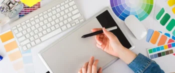
Just as a chef combines flavors to create a culinary masterpiece, a savvy marketer fuses colors and typography to craft aesthetically pleasing, persuasive content. When combined effectively, color and typography can significantly enhance brand recognition and encourage specific consumer responses. But how do these two elements mix?
Case Studies on Effective Use of Color and Typography
Let’s explore the use of colors and typography in some successful branding:
- Dropbox, for instance, uses a simple blue box logo on a white background. The unadorned, clean typeface aligns with the brand’s values of simplicity and organization. Conversely, the blue color conveys trust and dependability – essential for a service entrusted with protecting users’ files.
- McDonald’s famous golden arches feature vibrant yellow, complemented by a strong, bold typeface, instantly recognizable worldwide. Yellow is often associated with cheerfulness and friendliness, characteristics fast-food chains aim to foster, while the bold typeface signifies strength and reliability.
- The BBC employs a blocky, serif typeface, exuding an aura of authority and tradition, aligning with its commitment to trustworthy news. The black-and-white scheme conveys seriousness, signaling an established, reliable institution.
These brands have leveraged the power of colors and typography to influence consumer behavior in their favor, creating an unforgettable asset: brand identity.
Tips for Choosing Colors and Fonts in Marketing Strategies
To create a successful marketing strategy, understand your audience and their preferences. Consider the emotional responses that colors evoke and match them with your target audience’s desires. When selecting fonts, think about the typeface’s connotations. For example, serif fonts like Times New Roman signify tradition and dependability, while Sans-serif fonts like Helvetica are associated with modernity and usability. Consistency in color and fonts is crucial for building brand recognition and trust with your audience. These tips will give you an advantage in a competitive, consumer-driven market.
Conclusion
As we breathe life into our exploration of how graphic design influences consumer behavior, there’s no underestimating the role of colors and typography. These elements don’t just make the content look appealing but play a significant role in shaping consumers’ emotions, perceptions, and, most importantly, their buying choices.
Recap of the Day’s Insights
Throughout today’s dive, we’ve uncovered various revelations:
- The power of colors: Different colors can evoke various emotions in consumers. For example, blue tends to invoke feelings of tranquility, dependability, and trust, while red might inspire excitement, intense passion, or even urgency. This relationship is crucial for tailoring colors in marketing materials to resonate with customers on an emotional level.
- The thematic resonance of typography: We’ve also explored how typography can alter perception and comprehension. Certain fonts nurture a sense of formality or professionalism, while others may instill creative, casual, or vintage vibes. Understanding these underlying emotions helps in selecting the best typography for a product or brand message.
- Application in marketing strategies: Finally, we’ve demonstrated how these insights can be harnessed to craft compelling marketing strategies. By applying psychological principles related to color and typography, brands can forge deeper connections with consumers and enhance the chances of driving desired actions, such as purchases.
Preview of What’s Next in the Series
As our exploration continues into Day 7, we’ll shift our focus from the micro to the macro by looking at layout and composition – the larger framework encompassing color and typography. More than just arranging elements, we’ll delve into how spatial relationships and balance among different parts can create a harmony that captivates attention, seduces the eye, and keeps the reader engaged.
Stay tuned as we continue to unveil ways to effectively tap into the minds of consumers using graphic design as a quintessential tool in marketing.